
This document defines the visual language of Human Interest — how we look, how we communicate, and how we show up consistently across every touchpoint. Use it as a reference, not a constraint. Good judgment still applies.
Brand Voice
Human Interest shows up as a confident challenger — specific, plain-spoken, and grounded in proof. We don't lecture or warn; we show employers a world where businesses like theirs are already winning. The employer is always the hero. We're the guide that makes it possible.
- We show up as a confident challenger — specific, direct, and grounded in proof.
- We lead with data and real customer evidence, not marketing language.
- Visually, we make confident choices: bold typography, specific numbers, clean layouts that let the proof do the work. We don't decorate — we demonstrate.
- We speak plainly and design simply. No jargon, no complexity, nothing that makes an employer feel like this wasn't built for them.
- Our expertise shows up in clarity — both in the words we choose and the interfaces we build.
- We communicate with purpose and say only what matters.
- We show employers a world where businesses like theirs are already winning.
- We invite rather than warn, encourage rather than pressure.
- Visually, we use warmth — light, open design, imagery of real people and real businesses — to signal possibility rather than complexity.
- We're warm without being soft. Encouraging without being cheerful.
Logo
Our logo embodies our personality — optimistic, forward thinking, refreshingly honest, down to earth, and driven. The stacked version is our go-to for most instances.


Depending on the background, the logo may require a color variation. Darker backgrounds use all-white while keeping the teal dot. For monochromatic applications, solid white, solid navy or solid black only. No other variations are allowed.
Use the tagline lockup when introducing the brand in new contexts. The embroidery variant has a slightly heavier tagline weight for legibility on fabric and textured surfaces. Vertical distance between the stacked logo and the tagline is equal to the diameter of the teal dot in the logo.







Colors
Hex #022A4D
CMYK 100 63 12 67
PMS 7463 C
Hex #14B5AB
CMYK 81 0 39 0
PMS 326 C
Hex #FFFFFF
CMYK 0 0 0 0
These rules apply to all digital presentations inclduing emails, website, digital ads, etc. Human Interest Teal (#14B5AB) has three functional variants for digital use. Each meets WCAG AA contrast requirements on its intended background. Using the wrong variant fails accessibility standards.
Background "Atmospheres"
Radial gradients are a cornerstone of our brand image. Atmospheres are their named application — each maps to a specific content type and emotional register. They frame content; they never compete with it.
One Atmosphere per section. No overlapping.
Typography
employees
the best.
| Role | Font | Size / Weight | Example |
|---|---|---|---|
| Hero | Lora Regular 400 | 56px · lh 1.05 | Highest-rated 401(k) |
| H1 | Lora Regular 400 | 40px · lh 1.1 | You run your business. |
| H2 | Lora Regular 400 | 28px · lh 1.2 | Common questions |
| H3 / Subhead | Manrope SemiBold 600 | 20px · lh 1.3 | Design your plan |
| Eyebrow | Manrope ExtraBold 800 | 11px · uppercase · ls 2px | Why Human Interest |
| Body | Manrope Regular 400 | 16px · lh 1.7 | We handle the 401(k) things so you can focus on everything else. |
| UI Label | Manrope SemiBold 600 | 14px · lh 1.4 | Plan for my business |
| Caption | Manrope Regular 400 | 12px · lh 1.6 | Trusted by 10,000+ small businesses |
Selective teal (#14B5AB) applied to one phrase within a Lora headline only. Hero-level headlines only. Never in body copy or subheads.
When using an en dash ( – ) anywhere in copy — headlines, body, captions, UI labels — always include a space before and after it. This applies globally and must be consistent throughout every document, page, and template.
Photography
Our hero photography has one job: make the viewer feel seen. Every image should capture a person who has just realized their problem is understood and under control — warmth and confidence, not performance.
Hero images feature a single person making direct, warm eye contact. The subject has just noticed they've been seen — not posed, not selling. The expression sits at the intersection of relief and quiet confidence: someone finally gets it. Natural light, real environments, no staging.





Whenever possible, hero subjects are partially masked out of their original photo and placed on the page or an Atmosphere gradient. This convention will separate hero images from supporting secondary images, which can be contiained fully in a rectangular shape.

The subject is cut out with a soft edge that dissolves to transparent — not a hard rectangle, no drop shadow. The mask follows the top of the head, so the edge reads as a natural fade rather than a sticker cut from a photo. This is what lets the same hero subject sit on a flat white page, a photographic background, or an Atmosphere gradient without ever looking pasted in.
Secondary images capture real, unposed moments. Subjects are absorbed in their work or conversations — never looking at or performing for the camera. The viewer feels like they're observing something genuine, not staged. Real people in real work environments. The energy of an actual moment, not a posed group portrait.




The subject has just noticed they've been seen — warmth and quiet confidence, not performance. This is the "someone finally gets it" moment. Direct eye contact is required. The person looks like their problem is understood and under control. Expressions sit between relief and assurance. Always shot in a real place of work: office, kitchen, shop floor, restaurant, warehouse. The environment is visible and recognizable — it tells the viewer who this person is before they read a word.
Secondary images are a window into someone else's working life. The subject is absorbed in the moment — not aware of the camera, not performing for it. Whether one person or several are in frame, there's always a sense that they're not alone: a manager walking the floor with a team member, two coworkers reviewing something together, a small business owner helping a customer. The viewer is the observer of a real interaction. All secondary images must still be set in a real, identifiable place of work — no neutral backgrounds, no abstract settings.
Hero images convey warmth, quiet confidence, and relief — the person looks like they just got good news. Secondary images convey focus and connection — absorbed in a real interaction with someone else, not performing for the camera. Avoid serious or stern as a default register in either category.
No obvious studio setups, no stock-photo environments, no neutral backdrops. Images should feel taken, not directed. Direct eye contact is reserved exclusively for hero images — secondary images must never have the subject looking at the camera. A secondary subject making eye contact shifts the image from world-building to confrontational.
Every image — hero or secondary — is set in a real, recognizable place of work. Small businesses, warehouses, restaurant kitchens, open offices, shop floors. The environment tells half the story. Natural light whenever possible. The viewer should feel they could walk into the frame.
Anyone who works can save for retirement. Strike an even balance across races, genders, ages, and industries — both in individual shoots and across campaigns. No single demographic should dominate.
Data Visualization
Choosing the right way to display infographics fully depends on the information that needs to be depicted. Due to this fact, there is no hard set of rules to follow during the design phase. However, you may use the examples below as a visual guide for what can work. All data visualization should stay within the brand color system and remain legible at small sizes.
Icons
Our icon set ships in two matched variants. Light icons are built for white or light backgrounds; dark icons are built for navy or other dark backgrounds. Always pair the variant to its intended background — never place a light icon on navy or a dark icon on white.










































































Web Design System
Web-specific rules that extend the core brand. When this section conflicts with the core brand book, the web system rules take precedence for digital applications.
One per section max
Supporting actions
Tertiary actions on white
Links and soft CTAs
Simplified snapshots of product capabilities increase comprehension at a glance. UI representations should be clean, uncluttered, and clearly legible at reduced sizes.
Every pull quote opens with an oversized navy quotation mark — set in Lora, never italicized. Quote text is Lora as well, set a little larger than standard body copy for emphasis, with a Manrope attribution line below.
Use tables, checklists, and comparison layouts to display dense information clearly. Below are approved patterns.
| Feature | Essentials | Complete | Concierge |
|---|---|---|---|
| Payroll integration | ✓ | ✓ | ✓ |
| Investment selection | ✓ | ✓ | ✓ |
| Dedicated account manager | — | ✓ | ✓ |
| 3(16) Fiduciary services | — | — | ✓ |
Executions
How the Human Interest brand shows up in the real world — digital, print, and environmental. Supply final images to replace placeholders.
Each ad shown at its true pixel dimensions. All use a single “Atmosphere", Lora headlines, and a single CTA — navy buttons on light, teal on dark.


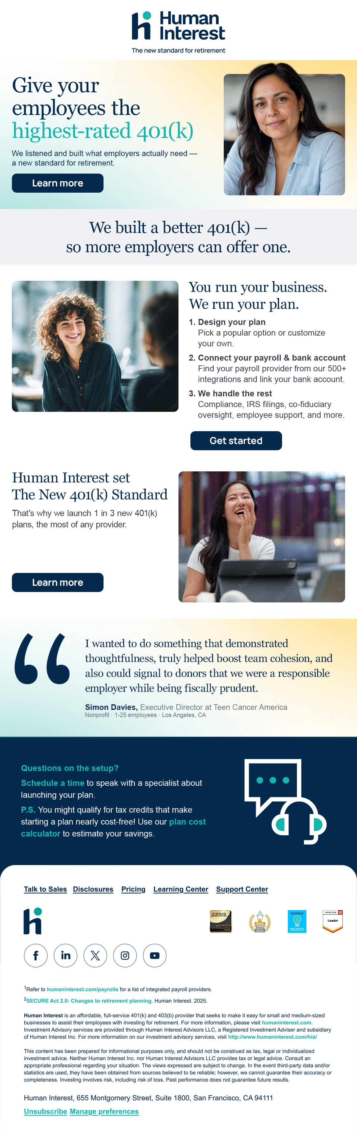
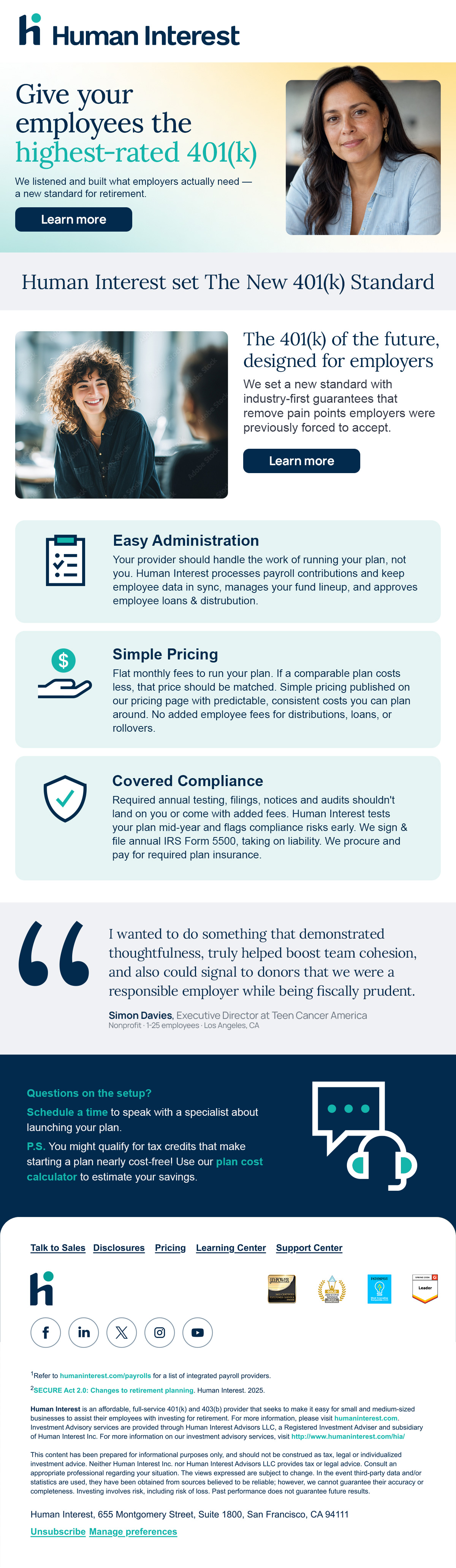
Marketing and lifecycle email follow the same system as the rest of the brand — Lora headline, Manrope body, one Atmosphere per block, single primary CTA, and a quiet, compliant footer.
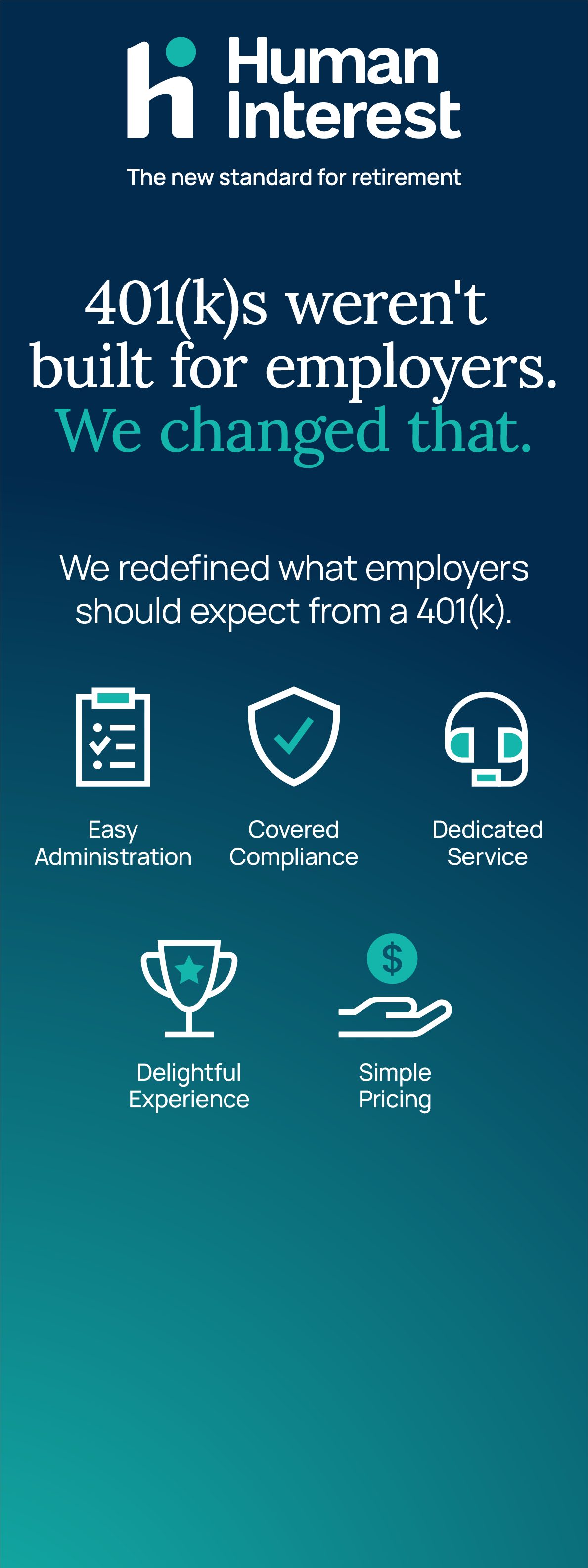
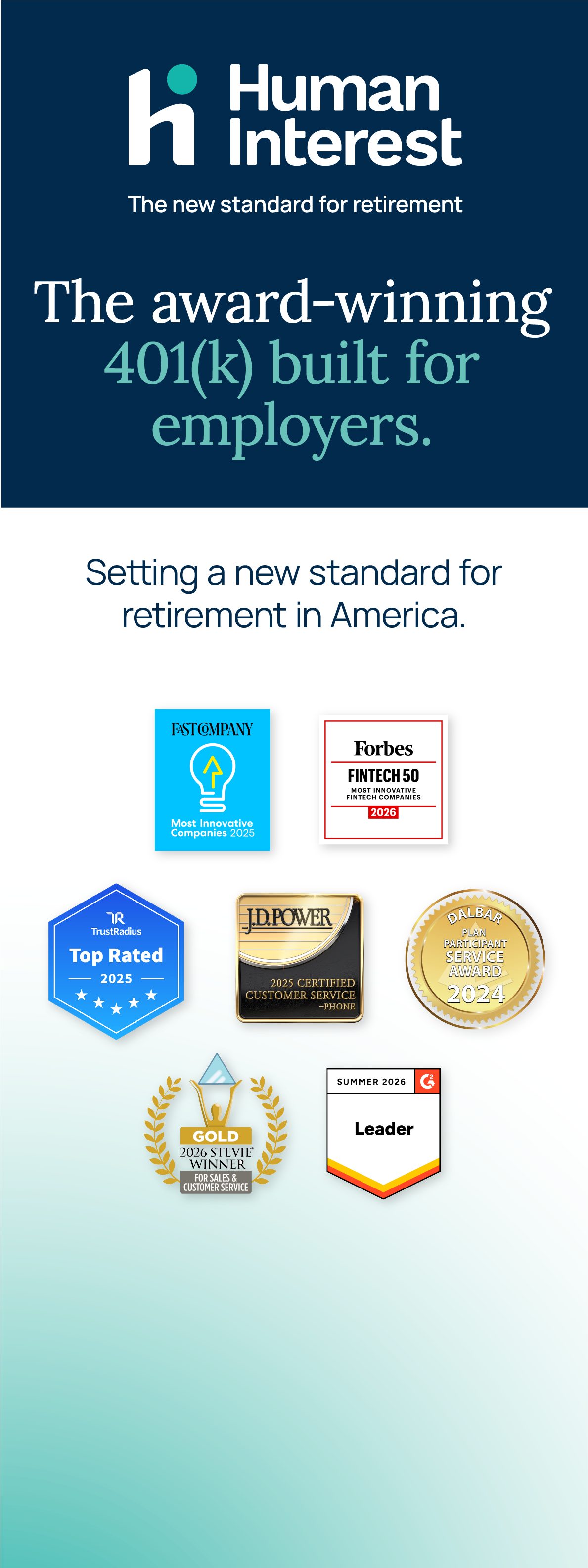
Three banner variants for event use — Depth (navy) for high-impact messaging, split light/navy for award and social proof. Always include the logotype. Key messaging should always show in the top third of the canvas to ensure eye-height communication. Try diligently to keep the bottom third devoid of any important messaging.

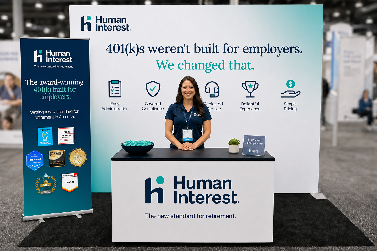
Back wall treatment using Atmosphere: Clarity (teal) on white. Icons reinforce the value proposition at a glance. No hero photographic images on the backdrop — reserve direct eye contact for pull-up banners.
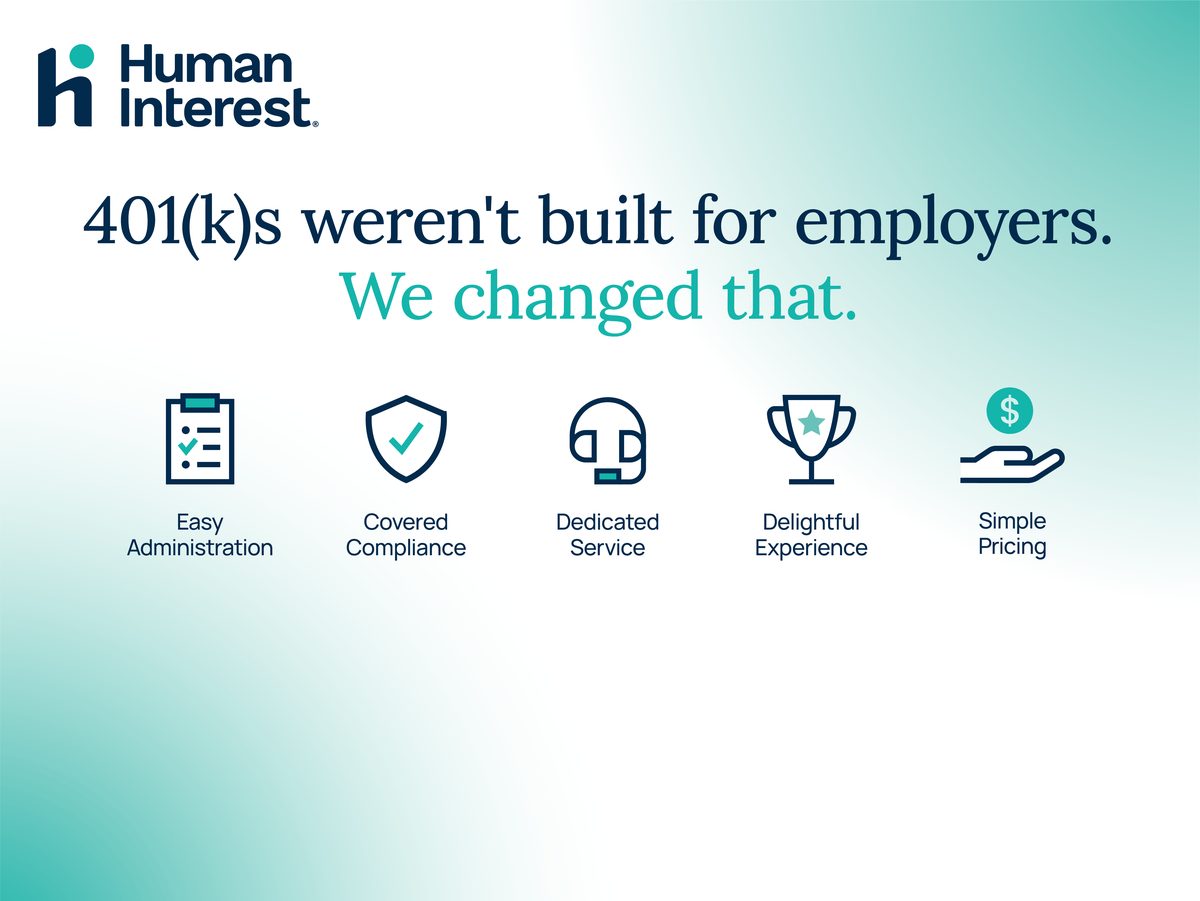
Full booth setup combining the event backdrop, pull-up banner, and a branded counter. Atmosphere: Clarity (teal) on the backdrop, value-prop icons at a glance, staffer front and center at the counter.